Updated artwork on my site. Comments welcome

M
Posted By
michael
Jan 8, 2008
Views
179
Replies
5
Status
Closed
I’m not a site designer so please disregard bad site design. I updated it with a couple new artwork pics I just finished and I don’t know who else to really show them to.

www.PixelKat.com

thanks

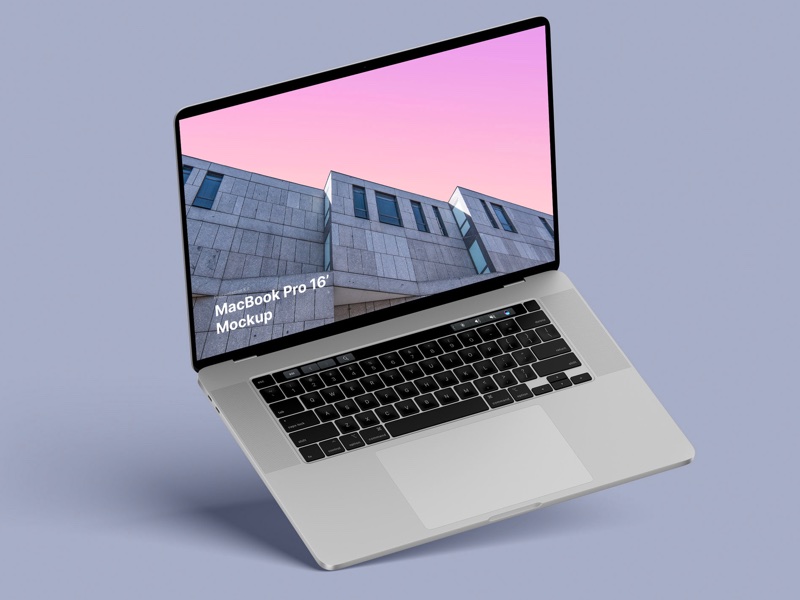
MacBook Pro 16” Mockups 🔥

– in 4 materials (clay versions included)

– 12 scenes

– 48 MacBook Pro 16″ mockups

– 6000 x 4500 px

R
ronviers
Jan 8, 2008
On Jan 8, 12:34 pm, "michael" wrote:
I’m not a site designer so please disregard bad site design. I updated it with a couple new artwork pics I just finished and I don’t know who else to really show them to.

www.PixelKat.com

thanks

I think your work is beautiful. I love your style. Your ability to use color is amazing.
I rushed through the gallery but I will come back to it later when I can stay longer. Thank you for posting.

Ron
TN
Tom Nelson
Jan 9, 2008
Some very nice work, Michael. You should change the link colors from the default purple and dark blue — they are hard to read against your black backgrounds.
Tom Nelson
Tom Nelson Photography

In article <wmPgj.5731$>, michael
wrote:

www.PixelKat.com
D
dvus
Jan 9, 2008
"michael" wrote in message

I’m not a site designer so please disregard bad site design. I updated it with a couple new artwork pics I just finished and I don’t know who else to
really show them to.

www.PixelKat.com

thanks

Be easier to comment if your images had titles. I’d hang that #7 on page 2 of the digital artwork on my wall any day.


dvus
W
Waterspider
Jan 9, 2008
"michael" wrote in message
I’m not a site designer so please disregard bad site design. I updated it with a couple new artwork pics I just finished and I don’t know who else to
really show them to.

www.PixelKat.com

thanks
You really need to do some work on your site, or hire someone to do a nice job of it. Putting great photography on an amateurish website is like serving caviar on a paper plate.
TC
tony cooper
Jan 9, 2008
On Tue, 8 Jan 2008 21:03:08 -0800, "Waterspider" wrote:

"michael" wrote in message
I’m not a site designer so please disregard bad site design. I updated it with a couple new artwork pics I just finished and I don’t know who else to
really show them to.

www.PixelKat.com

thanks
You really need to do some work on your site, or hire someone to do a nice job of it. Putting great photography on an amateurish website is like serving caviar on a paper plate.

I wouldn’t say the site is all that amateurish. There are some problems: primarily that the digital artwork is on a black background and all of the artwork tends to be darkish. The thumbnails blend in with the background and don’t represent much. A white background, or any lighter color, would show them off better. The guy with the swings and the dogs is the only thumbnail that invites a clicking.

The black background works on the Retouching page because the images contrast rather than blend in as they do on the digital artwork page.

The other point has been brought up before. The images are not titled or numbered, so it’s difficult to comment about a particular image.

Functionally, the pages work fine.


Tony Cooper – Orlando, Florida

Master Retouching Hair

Learn how to rescue details, remove flyaways, add volume, and enhance the definition of hair in any photo. We break down every tool and technique in Photoshop to get picture-perfect hair, every time.

Related Discussion Topics

Nice and short text about related topics in discussion sections