Views
721
Replies
0
Status
Closed
Alright, you asked for it! 🙂
First off, it’s always best to upload the pic to your personal web site, then provide a link to it from your newsgroup posting.
1. lipmarks on her cheek look a bit unnatural, kind of "pasted on". experiment with merge modes and opacities.
2. color cast on the girl doesn’t resemble the hues in the environment.
3. the selection around the girl is too abrubt. feather selections very slightly for things like this.
4. The center of the hearts might look better if they were transparent. They also look quickly "pasted" in… since the shadows on the hearts on the left side have white fringes.
5. The girl’s face seems ot lack the kind of contrast that exists in the scene.
other than that, your work is totally awesome! 🙂
JD
Related Tags

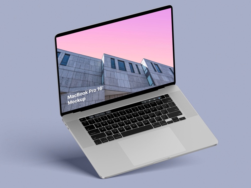
MacBook Pro 16” Mockups 🔥
– in 4 materials (clay versions included)
– 12 scenes
– 48 MacBook Pro 16″ mockups
– 6000 x 4500 px