
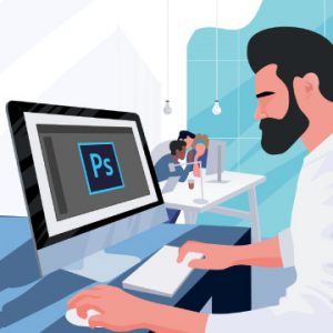
How to Improve Photoshop Performance
Learn how to optimize Photoshop for maximum speed, troubleshoot common issues, and keep your projects organized so that you can work faster than ever before!
Design resources, Photoshop add-ons, UI Kits and Inspiration
Learn how to optimize Photoshop for maximum speed, troubleshoot common issues, and keep your projects organized so that you can work faster than ever before!
I read somewhere that when designing a webpage with PS, you should work with an image size of 760 x 410 and design for someone having an 800×600 desktop.There is no "what everybody uses". 800×600 is still the most commonly used, that’s all.
I’m just wondering if that is what everyone else uses or is there a better image size to work with?
Thanks
"a:\" wrote:
I read somewhere that when designing a webpage with PS, you should work with an image size of 760 x 410 and design for someone having an 800×600 desktop.There is no "what everybody uses". 800×600 is still the most commonly used, that’s all.
I’m just wondering if that is what everyone else uses or is there a better image size to work with?
Thanks
On Mon, 02 Aug 2004 08:23:43 GMT, edjh scribbled:with
"a:\" wrote:
I read somewhere that when designing a webpage with PS, you should work
desktop.an image size of 760 x 410 and design for someone having an 800×600
betterI’m just wondering if that is what everyone else uses or is there a
image size to work with?There is no "what everybody uses". 800×600 is still the most commonly used, that’s all.
Thanks
And you can back that factual statement up of course?
"Voivod" wrote in message
On Mon, 02 Aug 2004 08:23:43 GMT, edjh scribbled:with
"a:\" wrote:
I read somewhere that when designing a webpage with PS, you should work
desktop.an image size of 760 x 410 and design for someone having an 800×600
betterI’m just wondering if that is what everyone else uses or is there a
image size to work with?There is no "what everybody uses". 800×600 is still the most commonly used, that’s all.
Thanks
And you can back that factual statement up of course?
Every office I’ve worked in used 800×600
On Mon, 02 Aug 2004 10:27:33 GMT, "Sam R"
scribbled:
There is no "what everybody uses". 800×600 is still the most commonly used, that’s all.
And you can back that factual statement up of course?
Every office I’ve worked in used 800×600
That’s not backing up a factual statement.
On Mon, 02 Aug 2004 10:27:33 GMT, "Sam R"
scribbled:
"Voivod" wrote in message
On Mon, 02 Aug 2004 08:23:43 GMT, edjh scribbled:with
"a:\" wrote:
I read somewhere that when designing a webpage with PS, you should work
desktop.an image size of 760 x 410 and design for someone having an 800×600
betterI’m just wondering if that is what everyone else uses or is there a
image size to work with?There is no "what everybody uses". 800×600 is still the most commonly used, that’s all.
Thanks
And you can back that factual statement up of course?
Every office I’ve worked in used 800×600
That’s not backing up a factual statement.
The reason 760×410 is used to size a webpage is given the viewers browser. Consider the toolbars and the slider on the side. If yoou were to use standard 600×800 then yoou wouold use the entie monitor of someone who has theres set to 600×800, therefore the veiwer woud have to use the sideways and up&down sliders to veiw your page in entirety. Hope that helps.
every webmaster i’ve ever talked to, says
work in 800×600.
I read somewhere that when designing a webpage with PS, you should workwith
an image size of 760 x 410 and design for someone having an 800×600desktop.
I’m just wondering if that is what everyone else uses or is there a better image size to work with?
Thanks
The reason 760×410 is used to size a webpage is given the viewers browser. Consider the toolbars and the slider on the side. If yoou were to use standard 600×800 then yoou wouold use the entie monitor of someone who has theres set to 600×800, therefore the veiwer woud have to use the sideways and up&down sliders to veiw your page in entirety. Hope that helps.
I read somewhere that when designing a webpage with PS, you should workwith
an image size of 760 x 410 and design for someone having an 800×600desktop.
I’m just wondering if that is what everyone else uses or is there a better image size to work with?
Thanks
The most popular screen resolutions on the web in the world are:
1. 1024 x 768 54.02%
2. 800 x 600 24.66%
3. 1280 x 1024 14.1%
4. 1152 x 864 4%
5. 640 x 480 0.6%
6. 1600 x 1200 0.8%
7. 1152 x 870 0.1%
It doesn’t address users (such as myself)
This is only reporting the users’ video resolutions. It doesn’t address users (such as myself) who run at a high resolution on a large format monitor but use the browser in a window — not full screen.
On Mon, 02 Aug 2004 08:23:43 GMT, edjh scribbled:I read it on the internet. And that’s good enough for me. Perhaps it’s changed."a:\" wrote:I read somewhere that when designing a webpage with PS, you should work with an image size of 760 x 410 and design for someone having an 800×600 desktop.
I’m just wondering if that is what everyone else uses or is there a better image size to work with?
Thanks
There is no "what everybody uses". 800×600 is still the most commonly used, that’s all.
And you can back that factual statement up of course?
no, but its a statment that as a real working professional, its what he saw. Its what I’ve seen too. I’m not going to say everybody on earth works in 800×600, but every webmaster i’ve ever talked to, says work in 800×600.
"Jeff H." wrote:
— snip —
The most popular screen resolutions on the web in the world are:
1. 1024 x 768 54.02%
2. 800 x 600 24.66%
3. 1280 x 1024 14.1%
4. 1152 x 864 4%
5. 640 x 480 0.6%
6. 1600 x 1200 0.8%
7. 1152 x 870 0.1%
— snip —
This is only reporting the users’ video resolutions. It doesn’t address users (such as myself) who run at a high resolution on a large format monitor but use the browser in a window — not full screen.
What’s the advantage of NOT running a browser full screen?Window/screen size should be immaterial to a well-designed site.
All I do is press Windows Key + D to minimize all apps at once and to view the desktop when required.
Even if it’s bigger it makes sense to design for a smaller rather than a larger size.
What’s the advantage of NOT running a browser full screen?
All I do is press Windows Key + D to minimize all apps at once and to view the desktop when required.
On Mon, 02 Aug 2004 15:40:55 -0400, Tom Thomas
wrote:
"Jeff H." wrote:
— snip —
The most popular screen resolutions on the web in the world are:
1. 1024 x 768 54.02%
2. 800 x 600 24.66%
3. 1280 x 1024 14.1%
4. 1152 x 864 4%
5. 640 x 480 0.6%
6. 1600 x 1200 0.8%
7. 1152 x 870 0.1%
— snip —
This is only reporting the users’ video resolutions. It doesn’t address users (such as myself) who run at a high resolution on a large format monitor but use the browser in a window — not full screen.
And for which any page designer who knows what they are doing will have designed to make the page fit any screen/window size.
I never design for less than 1024×768, yet none of my sites would have a problem at 640×480. Use the right techniques and it really doesn’t matter.
"Jeff H." wrote:
To each his own. But, no web page should be designed for a specific screen size. The whole point of proper HTML is that it adapts to the viewer’s environment.
——————————-
Tom
Unsolicited advertisements cheerfully ignored.
That sounds like a great technique, can you tell us more how to do this? Are those web designers who don’t use this technique just uninformed, or are there other problems associated with this technique, such as browser specific, etc.?
The easiest way for most people making small sites is to use nested tables. Basically, you set up a three column table, a fourth table sits in the middle column and you can adjust the percentage of the outer columns to give a minimum outer column size (to allow for nav bars) whilst making the centre a 100% column. The 100% means that the central column, and it’s contents will expand and contract to fill the available window space.—
hat’s a bit of a simplified explanation, but it’s mostly how it works.
You can also do something similar using CSS.
I have read over the conversation discussed here and felt that as a web designer
my personal experience and ‘business practices’ may assist people in designing
other sites.
I have read over the conversation discussed here and felt that as a web designertable,
my personal experience and ‘business practices’ may assist people in designing
other sites.
I personally design using the variable width table options allowed within HTML.
I utilise an array of nested tables with 100% widths for the overall
and limittable
navigational areas to fixed pixel widths.
For example on my business website, www.bluecrack.com. I have a large
with a number of tables nested inside. The outside one has a set width of 100%.links
This way, irrespective of the viewers/users resolution settings my site appears to
take up the full width of the window.
I have nested tables within my header area, so as to align navigational elements to
either the left or right. This is done using table cells and alignment within tags.
The left navigational element, currently containing a newsletter subscription box,
and to also hold in the future my client testimonials, has a fixed width set. This is
set to be a little wider than the name and e-mail form areas.
This is repeated on the other side of the screen with the promotional
to myone
hosting packages. Set to the same pixel width as the left column for consistency of
appearance.
At this point when users view this website, www.bluecrack.com, and change their
resolution settings, minimise the size of their viewing window, or open
of thethe
search/favourite/media portions of their browser the centre column of page content
adjusts accordingly. This is most visible on the copyright, and privacy policy pages.
Where the content extends for more than a single screen height.
I deem that this practice is integral to the success of a web site, and
design worksure
of the web site designer. Even in situations where you know for ‘certain’ the screen
resolution to be used, such as a business intranet, I still design using variable width
tables. Because you never know when hardware will be upgraded. And I am
nointranet
business is willing to pay you to come back in and re-design their
site purelyin
because it no longer takes up the entire browser window.
Design from the outset with the option to adjust to inevitable future changes that can
be outside of you control.
While this information, that I have presented is not directly related for designing web
sites using PhotoShop, I feel that is done address the initial question of whether ‘real’
people out there work for just one size browser and work within those constraints
imposed by the dimensions available within the on screen real estate.
I hope think helps clarify your thoughts for the designs that you may do
the future.
Fiona Fell
<< head creative geek
<< bluecrack multimedia
———————————————————– bluecrack multimedia : Supporting You and Your Business
Host your site with us NOW! and get the 1st Month FREE
Find us online @ http://www.bluecrack.com
———————————————————–
I have read over the conversation discussed here and felt that as a web designer
my personal experience and ‘business practices’ may assist people in designing
other sites.
I personally design using the variable width table options allowed within HTML.
I utilise an array of nested tables with 100% widths for the overall table, and limit
navigational areas to fixed pixel widths.
For example on my business website, www.bluecrack.com. I have a large table with a number of tables nested inside. The outside one has a set width of 100%.
This way, irrespective of the viewers/users resolution settings my site appears to
take up the full width of the window.
I have nested tables within my header area, so as to align navigational elements to
either the left or right. This is done using table cells and alignment within tags.
The left navigational element, currently containing a newsletter subscription box,
and to also hold in the future my client testimonials, has a fixed width set. This is
set to be a little wider than the name and e-mail form areas.
This is repeated on the other side of the screen with the promotional links to my
hosting packages. Set to the same pixel width as the left column for consistency of
appearance.
At this point when users view this website, www.bluecrack.com, and change their
resolution settings, minimise the size of their viewing window, or open one of the
search/favourite/media portions of their browser the centre column of page content
adjusts accordingly. This is most visible on the copyright, and privacy policy pages.
Where the content extends for more than a single screen height.
I deem that this practice is integral to the success of a web site, and the design work
of the web site designer. Even in situations where you know for ‘certain’ the screen
resolution to be used, such as a business intranet, I still design using variable width
tables. Because you never know when hardware will be upgraded. And I am sure no
business is willing to pay you to come back in and re-design their intranet site purely
because it no longer takes up the entire browser window.
Design from the outset with the option to adjust to inevitable future changes that can
be outside of you control.
While this information, that I have presented is not directly related for designing web
sites using PhotoShop, I feel that is done address the initial question of whether ‘real’
people out there work for just one size browser and work within those constraints
imposed by the dimensions available within the on screen real estate.
I hope think helps clarify your thoughts for the designs that you may do in the future.
Fiona Fell
<< head creative geek
<< bluecrack multimedia
———————————————————– bluecrack multimedia : Supporting You and Your Business
Host your site with us NOW! and get the 1st Month FREE
Find us online @ http://www.bluecrack.com
———————————————————–
What’s the advantage of NOT running a browser full screen?
All I do is press Windows Key + D to minimize all apps at once and to view the desktop when required.
JD
On Wed, 4 Aug 2004 13:26:57 +1000, "Fiona Fell : bluecrack multimedia" scribbled:
I have read over the conversation discussed here and felt that as a web designer
my personal experience and ‘business practices’ may assist people in designing
other sites.
You can’t even get word wrap right.
Thanks Fiona, for the insight. Nice to get some input from an actual expert willing to help, instead of criticize.
"Fiona Fell : bluecrack multimedia" wrote in
messageI have read over the conversation discussed here and felt that as a web designertable,
my personal experience and ‘business practices’ may assist people in designing
other sites.
I personally design using the variable width table options allowed within HTML.
I utilise an array of nested tables with 100% widths for the overall
and limittable
navigational areas to fixed pixel widths.
For example on my business website, www.bluecrack.com. I have a large
with a number of tables nested inside. The outside one has a set width of 100%.links
This way, irrespective of the viewers/users resolution settings my site appears to
take up the full width of the window.
I have nested tables within my header area, so as to align navigational elements to
either the left or right. This is done using table cells and alignment within tags.
The left navigational element, currently containing a newsletter subscription box,
and to also hold in the future my client testimonials, has a fixed width set. This is
set to be a little wider than the name and e-mail form areas.
This is repeated on the other side of the screen with the promotional
to myone
hosting packages. Set to the same pixel width as the left column for consistency of
appearance.
At this point when users view this website, www.bluecrack.com, and change their
resolution settings, minimise the size of their viewing window, or open
of thethe
search/favourite/media portions of their browser the centre column of page content
adjusts accordingly. This is most visible on the copyright, and privacy policy pages.
Where the content extends for more than a single screen height.
I deem that this practice is integral to the success of a web site, and
design worksure
of the web site designer. Even in situations where you know for ‘certain’ the screen
resolution to be used, such as a business intranet, I still design using variable width
tables. Because you never know when hardware will be upgraded. And I am
nointranet
business is willing to pay you to come back in and re-design their
site purelyin
because it no longer takes up the entire browser window.
Design from the outset with the option to adjust to inevitable future changes that can
be outside of you control.
While this information, that I have presented is not directly related for designing web
sites using PhotoShop, I feel that is done address the initial question of whether ‘real’
people out there work for just one size browser and work within those constraints
imposed by the dimensions available within the on screen real estate.
I hope think helps clarify your thoughts for the designs that you may do
the future.
Fiona Fell
<< head creative geek
<< bluecrack multimedia
———————————————————– bluecrack multimedia : Supporting You and Your Business
Host your site with us NOW! and get the 1st Month FREE
Find us online @ http://www.bluecrack.com
———————————————————–
Hi, There is nothing wrong with a higher resolution, 1024 x 768 is OK let people upgrade to higher or tell them to! by giving the following. "This site is best in 1024 x 768" I hate when they make pages for 800 x600
what a vaste of space on the desktop! I use high res 1280 x 960 and have fullFunny post… I use two monitors side by side at work, one at 1920 x 1600 and one at 1024 x 768, but I make sure all my sites look good at 800 x 600 and again look good at higher resolutions…
menus in every program witout scrolling! It’s just a question of settings!
And what they have in offices????!!!!
Don’t surf the internet during worktime! – Back to work!!!!
Pepe
An ‘actual expert’ who can’t even compose a sentence without fucking it up?I must have missed your constructive input, and I don’t mean the thumb that is up your ass. I mean where you actually formed a helping thought.
That sounds like a great technique, can you tell us more how to do this? Are those web designers who don’t use this technique just uninformed, or are there other problems associated with this technique, such as browser specific, etc.?
I think someone may have hijacked Voivod’s idWell, I certainly apologize if it is not the real poster. But if it was the real voivod, the person needs some serious attitude adjustment, lol.
Voivod is usually far more subtle and sublime
Will the real Voivod please post in?
"hemorrvoid" popped in messageFight! Fight!!
An ‘actual expert’ who can’t even compose a sentence without fucking it up?
I must have missed your constructive input, and I don’t mean the thumb that is up your ass. I mean where you actually formed a helping thought.
I have read over the conversation discussed here and felt that as a web designer<snip>
my personal experience and ‘business practices’ may assist people in designing
other sites.
I personally design using the variable width table options allowed within HTML.
I utilise an array of nested tables with 100% widths for the overall table, and limit
navigational areas to fixed pixel widths.
I hope think helps clarify your thoughts for the designs that you may do in the future.
Fiona Fell
Jesper wrote:that
"hemorrvoid" popped in message
An ‘actual expert’ who can’t even compose a sentence without fucking it up?
I must have missed your constructive input, and I don’t mean the thumb
is up your ass. I mean where you actually formed a helping thought.Fight! Fight!!
"Arty Phacting" wrote in message
I think someone may have hijacked Voivod’s idWell, I certainly apologize if it is not the real poster. But if it was the real voivod, the person needs some serious attitude adjustment, lol.
Voivod is usually far more subtle and sublime
Will the real Voivod please post in?
Please forgive my ‘obviously’ abysmal use of word wrap. If the use of word wrap is seen as the most important element to a post, then I may hesitateto
contribute in the future to this group. To assist others, I shall continue to post until another petty unrelated offtopic discussion begins in response.design,
I understand that CSS offer alternative to my hard coded HTML tables
but I have designed for my audience, current and anticipated. Many of the people who are looking for design services in my region have only accessto
public library Internet resources, and browser versions that are olderthan
most. I do not want to alienate those that do not have the most up-to-date technology from viewing an accurate representation of my intended design.same
I understand also that my breadcrumbs are not presented in exactly the
way others have done, I appreciate your comments and suggestions and will take heed to them in my next site design revision.
—
Fiona Fell
<< head creative geek
<< bluecrack multimedia
———————————————————– bluecrack multimedia : Supporting You and Your Business
Host your site with us NOW! and get the 1st Month FREE
Find us online @ http://www.bluecrack.com
———————————————————–
I understand that CSS offer alternative to my hard coded HTML tables design, but I have designed for my audience, current and anticipated. Many of the people who are looking for design services in my region have only access to public library Internet resources, and browser versions that are older than most. I do not want to alienate those that do not have the most up-to-date technology from viewing an accurate representation of my intended design.
Jeff,Assuming you’re using Windows, you can keep all the pages up if you want and cycle through them using alt-tab. Then, (if you’re using XP) you can just click "show desktop" on the windows toolbar to collapse them all immediately.
I work this way, with IE in a window – I have my e-mail box open in back so when a new msg comes in, I can see if it’s spam (ignore), business (attend to right now) or family junk (depends who it is). I also have a word doc open, waiting to cut and paste information from the web. Other times I have an open database that I’m correcting using information from the web and again, cut and paste from. It’s MUCH more efficient to work with multiple programs not only open but ‘up’ – if you have the space to do it in:)
But I also use the Win+D because I’ve got my desktop set up like a webpage with links to frequently used files, programs, websites and information done in flash. Makes my navigation of frequently used files and sites so much faster.
wrote:
That sounds like a great technique, can you tell us more how to do this? Are those web designers who don’t use this technique just uninformed, or are there other problems associated with this technique, such as browser specific, etc.?
Here’s an entertaining rant on "browser specific" sites etc. http://members.optusnet.com.au/~night.owl/morons.html
(back to lurking)
Assuming you’re using Windows, you can keep all the pages up if you want and cycle through them using alt-tab. Then, (if you’re using XP) you can just click "show desktop" on the windows toolbar to collapse them all immediately.
"hemorrvoid" popped in message
An ‘actual expert’ who can’t even compose a sentence without fucking it up?I must have missed your constructive input, and I don’t mean the thumb that
is up your ass. I mean where you actually formed a helping thought.
Please forgive my ‘obviously’ abysmal use of word wrap. If the use of word wrap is seen as the most important element to a post, then I may hesitate to
contribute in the future to this group. To assist others, I shall continue
to post until another petty unrelated offtopic discussion begins in response.
On Thu, 5 Aug 2004 09:24:56 +1000, "Fiona Fell : bluecrack multimedia" wrote:
I understand that CSS offer alternative to my hard coded HTML tables design, but I have designed for my audience, current and anticipated. Many of the people who are looking for design services in my region have only access to public library Internet resources, and browser versions that are older than most. I do not want to alienate those that do not have the most up-to-date technology from viewing an accurate representation of my intended design.
Hi Fiona,
I always used to code the pages using tables as well, but it’s wise to move onto CSS wherever possible because that’s the way the standards are moving. It also makes it much easier to use XML which is also the ways standards are going. Whilst I appreciate that you want a form of backwards compatibility I would suggest building the same site twice (using Dreamweaver templates you won’t have to repeat most of the site anyway, and serve the required pages to older browsers and the CSS to newer ones. It only requires a browser check when the person first hits the site.
"hemorrvoid" blew:
On Wed, 4 Aug 2004 16:02:46 -0400, "Jesper" scribbled:that
"hemorrvoid" popped in message
An ‘actual expert’ who can’t even compose a sentence without fucking it up?I must have missed your constructive input, and I don’t mean the thumb
I must have missed you being proclaimed God-King of usenet and your subsequent rules of behavior proclamation….
is up your ass. I mean where you actually formed a helping thought.
"Don’t believe someone is an expert web designer if they can’t even compose a sentence properly." is a helpful thought.
On Wed, 4 Aug 2004 10:40:11 -0400, "Mary E. Hill" wrote:soJeff,
I work this way, with IE in a window – I have my e-mail box open in back
(attendwhen a new msg comes in, I can see if it’s spam (ignore), business
haveto right now) or family junk (depends who it is). I also have a word doc open, waiting to cut and paste information from the web. Other times I
webpagean open database that I’m correcting using information from the web and again, cut and paste from. It’s MUCH more efficient to work with multiple programs not only open but ‘up’ – if you have the space to do it in:)
But I also use the Win+D because I’ve got my desktop set up like a
donewith links to frequently used files, programs, websites and information
in flash. Makes my navigation of frequently used files and sites so much faster.Assuming you’re using Windows, you can keep all the pages up if you want and cycle through them using alt-tab. Then, (if you’re using XP) you can just click "show desktop" on the windows toolbar to collapse them all immediately.
—
Hecate – The Real One
veni, vidi, reliqui
Please forgive my ‘obviously’ abysmal use of word wrap. If the use of word wrap is seen as the most important element to a post, then I may hesitateto
contribute in the future to this group. To assist others, I shall continue to post until another petty unrelated offtopic discussion begins in response.design,
I understand that CSS offer alternative to my hard coded HTML tables
but I have designed for my audience, current and anticipated. Many of the people who are looking for design services in my region have only accessto
public library Internet resources, and browser versions that are olderthan
most. I do not want to alienate those that do not have the most up-to-date technology from viewing an accurate representation of my intended design.same
I understand also that my breadcrumbs are not presented in exactly the
way others have done, I appreciate your comments and suggestions and will take heed to them in my next site design revision.
—
Fiona Fell
<< head creative geek
<< bluecrack multimedia
———————————————————– bluecrack multimedia : Supporting You and Your Business
Host your site with us NOW! and get the 1st Month FREE
Find us online @ http://www.bluecrack.com
———————————————————–
"hemorrvoid" blew:On Wed, 4 Aug 2004 16:02:46 -0400, "Jesper" scribbled:that
"hemorrvoid" popped in message
An ‘actual expert’ who can’t even compose a sentence without fucking it up?I must have missed your constructive input, and I don’t mean the thumb
I must have missed you being proclaimed God-King of usenet and your subsequent rules of behavior proclamation….
Sorry you missed that.
is up your ass. I mean where you actually formed a helping thought.
"Don’t believe someone is an expert web designer if they can’t even compose a sentence properly." is a helpful thought.
What you believe is irrelevant here. Now go outside and wait for your school
As a beginner web page designer, I find that the books and tutorials don’t go into too much details about designing pages for the widest audience possible. Perhaps that’s why so many sites are done without this consideration. If there are books or tutorials on this topic, please let me know.
Because, ya know, I wouldn’t have time to screw around in an ng if I don’t ultra conserve every second I can 😉LOL! I find it a bit of light relief, plus the chance to learn some useful info. At least, that’s what I tell my boss. <g> But then, that’s not a problem because I *am* my boss 😉
Hi Fionaword
Please don’t take the naughty comments to heart
It is good to have you posting here – there is a regular bunch of posters and I think sometimes we try to outdo each other in who’s the most haughty
But I for one welcome you here and your postings
Arts
"Fiona Fell : bluecrack multimedia" wrote in
messagePlease forgive my ‘obviously’ abysmal use of word wrap. If the use of
hesitatewrap is seen as the most important element to a post, then I may
tocontinue
contribute in the future to this group. To assist others, I shall
theto post until another petty unrelated offtopic discussion begins in response.design,
I understand that CSS offer alternative to my hard coded HTML tables
but I have designed for my audience, current and anticipated. Many of
up-to-datepeople who are looking for design services in my region have only accessto
public library Internet resources, and browser versions that are olderthan
most. I do not want to alienate those that do not have the most
design.technology from viewing an accurate representation of my intended
willI understand also that my breadcrumbs are not presented in exactly thesame
way others have done, I appreciate your comments and suggestions and
take heed to them in my next site design revision.
—
Fiona Fell
<< head creative geek
<< bluecrack multimedia
———————————————————– bluecrack multimedia : Supporting You and Your Business
Host your site with us NOW! and get the 1st Month FREE
Find us online @ http://www.bluecrack.com
———————————————————–
On Thu, 5 Aug 2004 09:12:45 -0400, "Mary E. Hill" wrote:don’t
Because, ya know, I wouldn’t have time to screw around in an ng if I
ultra conserve every second I can 😉LOL! I find it a bit of light relief, plus the chance to learn some useful info. At least, that’s what I tell my boss. <g> But then, that’s not a problem because I *am* my boss 😉
—
Hecate – The Real One
veni, vidi, reliqui
On Thu, 05 Aug 2004 11:23:47 GMT, wrote:
As a beginner web page designer, I find that the books and tutorials don’t go into too much details about designing pages for the widest audience possible. Perhaps that’s why so many sites are done without this consideration. If there are books or tutorials on this topic, please let me know.
First, make yourself familiar with (the admittedly dry and occasionally boring <g>) stuff at www.w3.org.
Look at lots of web sites and see what they do right – and more importantly, what they do wrong. Examine the source code for stuff you find interesting or useful.
Get yourself a book on html – something like "Mastering HTML" which also gives you a reference section with all the HTML tags, and info about scripting and so forth. Also look for books which include XHTML. And then there’s CSS. There’s a "Visual Quickstart" book which covers all three, and there books are usually good starting places.
I don’t know what software you’re using but look for something like "Macromedia Dreamweaver Training from The Source", if you use DW. (If you do use Macromedia products, books form The Source are excellent).
Also, look for books that are purely about design rather than coding: for instance, "Designing with Web Standards" by Zeldman.
Hope that’s enough to get you started.
—
Hecate – The Real One
veni, vidi, reliqui
On Wed, 4 Aug 2004 13:26:57 +1000, "Fiona Fell : bluecrack multimedia" scribbled:Ouch ! 😉
I have read over the conversation discussed here and felt that as a web designer
my personal experience and ‘business practices’ may assist people in designing
other sites.
You can’t even get word wrap right.
"Voivod" wrote in message
On Wed, 4 Aug 2004 13:26:57 +1000, "Fiona Fell : bluecrack multimedia" scribbled:Ouch ! 😉
I have read over the conversation discussed here and felt that as a web designer
my personal experience and ‘business practices’ may assist people in designing
other sites.
You can’t even get word wrap right.
Stephan
"Hecate" wrote in messageYou just have to learn who to ignore 😉
On Thu, 5 Aug 2004 09:12:45 -0400, "Mary E. Hill" wrote:don’t
Because, ya know, I wouldn’t have time to screw around in an ng if I
ultra conserve every second I can 😉LOL! I find it a bit of light relief, plus the chance to learn some useful info. At least, that’s what I tell my boss. <g> But then, that’s not a problem because I *am* my boss 😉
—
Hecate – The Real One
veni, vidi, reliqui
Yes! I do learn loads from all the ng’s I check out. Not formally trained in any of this – have a degree in business admin, nothing creative like I ended up doing. NGs are great:)
ah Stephan behold the mighty one has spoke
He (or she or the one) uses few word with great effect
tis a wonder to behold
Arts
ps – you will soon be a disciple too?
A

Easy-to-use drag-n-drop Photoshop scene creator with more than 2800 items.
Nice and short text about related topics in discussion sections


