developing a style..

R
Posted By
Ray
Feb 23, 2005
Views
219
Replies
1
Status
Closed
i’m pretty new to this graphic imagery business, also to PS and other manipulators. I see so much badly executed and brilliantly executed stuff about. however i have finally produced something (it’s taken 2 weeks from knowing nothing) and i am slowly finding my way….

so what do ppl think of this pls?

http://M74.vze.com
ray.

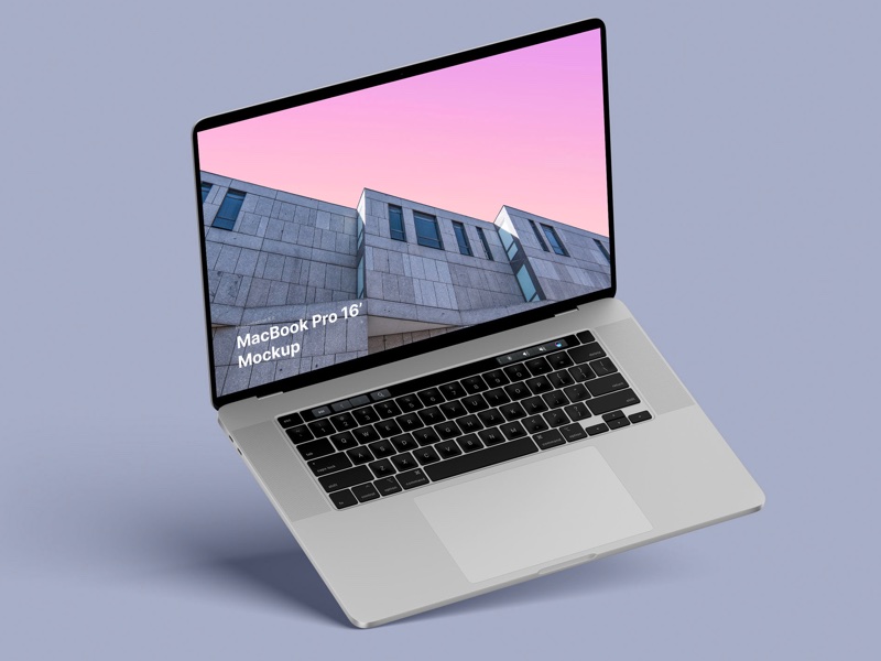
MacBook Pro 16” Mockups 🔥

– in 4 materials (clay versions included)

– 12 scenes

– 48 MacBook Pro 16″ mockups

– 6000 x 4500 px

MR
Mike Russell
Feb 26, 2005
Ray wrote:
i’m pretty new to this graphic imagery business, also to PS and other manipulators. I see so much badly executed and brilliantly executed stuff about. however i have finally produced something (it’s taken 2 weeks from knowing nothing) and i am slowly finding my way….
so what do ppl think of this pls?

http://M74.vze.com
ray.

Visually interesting with good composition and use of color. The red marks add some accent, but in the end are a distraction – I would add more, say to the whole bottom left corner, or figure out another way to add color.

There’s the question of how you see the actual use of the image – for a magazine you would want a more or less clear area or unsaturated area where a title or text could be overlaid, so you might want to expand the image a bit to add more space.


Mike Russell
www.curvemeister.com
www.geigy.2y.net

MacBook Pro 16” Mockups 🔥

– in 4 materials (clay versions included)

– 12 scenes

– 48 MacBook Pro 16″ mockups

– 6000 x 4500 px

Related Discussion Topics

Nice and short text about related topics in discussion sections