What size and resolution should I make my website at, and how can I get it so it is optimized for size for all computers. I’m new at this so please help me out with what the best steps would be to start making a website in photoshop. Thanks.
The best websites are not designed for any single size, since there are thousands of possibilities of window size. Better to make a site that uses tables or CSS to position items that make best use of whatever space is available.
With Tables this is usually done with a three column table, with the left and right columns of fixed width and the middle column of variable width to use the rest of the space. Amazon and Ebay use this type of method.
If you are insisting on a fixed size, I recommend 800×600 screen size, which would be a PS size of about 770×450.
Firstly, I would say that to make a Web site, you need a Web authoring tool. PS [and IR] can help you do the work – like preparing images, but you really need something else to build a complete Web site.
2 key things: – the resolution of images on a Web site is irrelevant – the size of an image in pixels is what counts [if you keep images less than 800×600 you will generally be OK]
What size and resolution should I make my website at, and how can I get it so it is optimized for size for all computers. I’m new at this so please help me out with what the best steps would be to start making a website in photoshop. Thanks.
bryce, look into go live if this is your first leap into web design. if you want to design using css, then a different tool is needed. i started with go live in 2000. worked fine until i wanted to design with css. it did ok with hand coding, if you want to go that far, but not the best css tool. best, dwain
A slight disagreement with image resolution Colin, though probably out of pure ignorance or lack of experience on my part. Images should ideally be at 72dpi for 1:1 viewing. If you have a really small picture you COULD present that at a higher resolution – which will increase it’s size to the viewer in a Browser. I’d be interested in further comments… we’ve all got to learn somehow 😉
Telling the Browser how big the image is – in pixel height and width is good practice, as it allows a slightly faster page and image loading I’ve found.
A slight disagreement with image resolution Colin, though probably out of pure ignorance or lack of experience on my part. Images should ideally be at 72dpi for 1:1 viewing
Normal behaviour for a Web browser is the place the image on the screen pixel for pixel like it is. The PPI [not DPI!] is ignored. Actually, if you use Save for Web, no resolution info is included in the file.
If you have a really small picture you COULD present that at a higher resolution – which will increase it’s size to the viewer in a Browser.
Sorry, this is not logical [given my comments above].
Telling the Browser how big the image is – in pixel height and width is good practice, as it allows a slightly faster page and image loading I’ve found.
I haven’t played with this, but it sounds illogical. If a browser finds an image size specification, it would have to resample, which could only take [a little] more time.
The nice thing about working with images fo the Web is you have a very clear idea of what the result will look like. If you create an image of the right size and view at 100% in PS [or use the SfW preview], you see it at the size it’ll be in a browser.
The only thing that changes this is IE’s autozoom facility, which fits an image to the available window space. This is there to help out viewers of full, multi-megapixel pictures that have been posted by those not versed in the info above.
I’ll settle for you having a lack of experience and not accuse you of ignorance [unless you come back and argue with me! :-)].
Images should ideally be at 72dpi for 1:1 viewing<<
It doesn’t matter a damn WHAT the ppi of the image is – in fact some web formats (i.e.gif) carry NO sizing meta-data in the file format at all. They have NO physical sizing data, just the pixel dimensions. It is up to the receiving application to ‘decide’ at what size to display.
In the case of web browser, this will be one image pixel for one screen pixel. Consequently the physical (dimensional) display size will be dependent upon the monitor rez and monitor size. A 300px by 300px image will display at a very different size on a 21" monitor running at 1600 x 1200 (approximately 3 x 3 inches) a 14" monitor running at 640 x 480 (approximately 5.25 x 5.25 inches), and the 21" running at 640 x 480 (approximately 7.5 by 7.5 inches)
Telling the Browser how big the image is – in pixel height and width is
good practice<<
Certainly. Otherwise the browser has to examine the file data before displaying it.
That allows the browser to use its engine to resample your image, creating a virtual substitute, and displays that. Diappointing results.
Try this: Save an image, then downsample it to 50% of the original size and save it. Now create a page which displays the original image at 50%, and the one you downsampled in PS at 100%.
I’ve been building sites for over 9 years – I use just about every product out there, but my favorite and the combo that builds the most sites for me is Photoshop for the foundational design, then Go-Live to actually put it all together. Whenever I ‘save for web’ in photoshop, I always save it as a jpeg at 64%.
As far as size of the site – it depends on the audience of the site. If it’s just for the general public, I’d do 1024 X 768 for the overall size. If you do a search for web stats, you’ll find that 800 X 600 is less than 5% of the browsers out there.
If the site is for a specialized bunch of folks, then you need to figure out what their machines are all set at and what kind of computers (mac or pc, unix etc). ex: i did an intranet site for a bunch of scientific nerd types. Everyone’s PC had a 21" monitor and everyone had their resolutions set VERY high, so I did their site at 2048 X 1024.
"Whenever I ‘save for web’ in photoshop, I always save it as a jpeg at 64%."
Seems to me that might not be the best thing to do, unless your main goal is to be able to compress images automatically, while giving less thought and judgement to percentages that might be better suited for a particular image. Also, there are certainly times when GIF is the better choice, but I’ll not address that within the confines of this reply.
Certainly, there are some images that will look just as good at a setting of, say "18"…or "24"…or "30" as they would at your automatic setting of 64. Plus, therre are the added benefits of a reduction in file size and a concomitant increase in loading speed.
The point I’m trying to make is that, unless all of the images you optimise for the web are VERY similar, you’re doing a disservice to your clients by not compressing each image individually, paying attention visually to the quality vs. file size trade-offs. Doing this requires more active decision-making, but will ultimately produce the best, most efficient (for the end-user) results.
Stats from our own sites (some 14, one of which has a 14 gig/month bandwidth requirement with no large downloads available) would echo the above statistics.
Screen resolution doesn’t account for those who don’t show their browser windows full-screen. People do other things with their computers while they surf.
Reading everything that’s gone before, including MY own dross, all I can say is that this place is a great learning institution.
I built a site (years ago) which was based on the then "standard" 800×600 screen (maximised of course) but then along came later boxes. So, my pre-set backgrounds repeated on themselves when viewed at higher settings, or left rather large empty spaces. Most annoying, cos it made me look like the dunce I actually am.
Apologies (with corrective thanks) to those who have pointed out my mistakes.
The people I know with 800X600 monitors that have internet access don’t surf much. My guess is that if they have a monitor that is that poor, their PC is even poorer, and they have such a slow connection that they will rarely venture onto the web. when they do manage to dial in, they won’t stay long because of a slow connection, poor viewing, lack of experience, and a rapidly increasing frustration level.
People with an interest in the web will generally invest the $50 for at least a 17" monitor. IMHO
Jon wrote in message
Michael,
If you do a search for web stats, you’ll find that 800 X 600 is
less
than 5% of the browsers out there.<<
I don’t know where you are getting your stats from, but believe me, you’re
excluding an awful lot of users! 800 x 600 is more like 40% than 5%
Here are the first 3 sets of stats I just picked up from Google Site 1
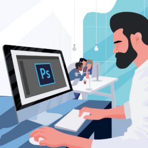
Learn how to optimize Photoshop for maximum speed, troubleshoot common issues, and keep your projects organized so that you can work faster than ever before!
Related Discussion Topics
Nice and short text about related topics in discussion sections